


Data Visualization: Treemap
Treemap is a type of data visualization that displays data hierarchically. Here you will find its features, functions, recommendations, related visualizations, and entertaining examples.
Available in:
By: Juan Pablo Garnica Munévar. Published: August 20, 2021.
What a treemap is?
A treemap is a type of visualization that hierarchically displays data. It has the structure of a tree (hence the name) with the data organized in nested rectangles (one inside the other). The size of the rectangle corresponds to the value of the category or subcategory.
The rectangles are called nodes and are of root or leaf type. The root node is the first one (it does not arise from another one), while the leaf node detaches from another one and is the last in the hierarchy. That means that the root node (category) total is the sum of the leaf nodes (subcategories). So, this type of visualization makes it possible to compare between subcategories and between categories.
Colors represent the classification between rectangles, which makes it easy to identify the categories.

Treemap of laughter expressions used on Reddit in 2019 organized by category. Source: https://pudding.cool/2019/10/laugh/
What it is for?
According to Data Viz Project, the treemap belongs to the graph family and helps compare and distribute data. The table from which one creates the visualization has categories that display subcategories with their respective numerical values.
From Data to Viz specifies that treemaps are used to show both the division of the whole and the hierarchical organization. For the former, it presents the category or entity with the highest value compared to the others. For the latter, it allows showing up to three levels of a hierarchy.
The advantage of the treemap is the efficient use of space to represent large amounts of information. In fact, its history dates back to Ben Schneiderman’s compact visualization of an entire directory of files on a computer.
Recommendations
From Data to Viz recommends making a maximum of three hierarchy levels to facilitate understanding, prioritizing the highest level, and making interactive versions that help you explore the results.
This type of visualization helps you answer these questions: Which category has the highest proportion, i.e., which has the most value within the data? What subcategories does each category have? Which category has the most subcategories? How many levels of hierarchy are there per category?
Related visualizations
Because the treemap is a type of visualization of proportions and part of a whole, it is related to the dendrogram, circle packing, the sunburst diagram, and the Marimekko diagram.
Examples
Ferdio’s Flag Stories project made several visualizations about flags according to their shapes, colors, the number of changes, designs, among other things. One of them is a treemap of the most dominant colors in the flags of the world.
The colors (categories) group tones (subcategories) of all flags hierarchically. This visualization has two levels of hierarchy. There you can compare the proportions between colors: white predominates along with the primary colors.

Treemap of the most dominant colors in the flags of the world. Source: https://flagstories.co/
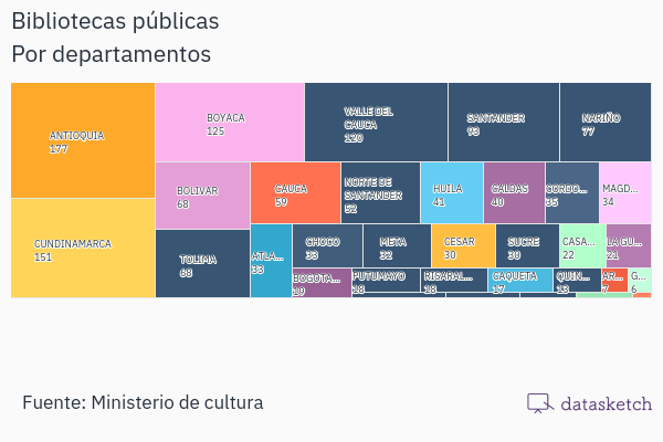
At Datasketch, we made a treemap of public libraries by departments in Colombia (es). In this case, there is no hierarchy among the data. Therefore, the visualization also serves to show the value of several categories as a bar chart.
Treemaps and art
Dimitris Ladopoulos programmed an algorithm to convert portraits to treemaps. It produces a mosaic in which each rectangle represents a color in the RGB color model. Ladopoulos made treemaps of the portraits of Johannes Wtenbogaert (by Rembrandt Harmenszoon van Rijn) and Rosalba Peale (by Rembrandt Peale).

Treemap from the Portrait of Rosalba Peale. Source: https://www.behance.net/gallery/59791519/Portrait-nr2-Rosalba
Make your own treemap with the Simple Charts app, available at https://www.datasketch.co/apps/. Create an account and sign in! You can also subscribe to our newsletter for news related to data journalism:
References
- ArcGIS Insights. (n.d.). Crear y utilizar un mapa de árbol. Retrieved August 13, 2021, from https://doc.arcgis.com/es/insights/latest/create/treemap.htm
- Ferdio. (n.d.). Treemap. Data Viz Project. Retrieved August 13, 2021, from https://datavizproject.com/data-type/treemap/
- HighBond. (n.d.). Diagrama de árbol (treemap). HighBond. Retrieved August 13, 2021, from https://help.highbond.com/helpdocs/highbond/es/Content/visualizations/interpretations/charts/treemap_chart.htm
- Holtz, Y., & Healy, C. (n.d.). Treemap. From Data to Viz. Retrieved August 13, 2021, from https://www.data-to-viz.com/graph/treemap.html
- IBM. (2021, March 4). Gráficos de mapa del árbol. IBM. https://www.ibm.com/docs/es/spss-statistics/version-missing?topic=types-treemap-charts
- Shneiderman, B., & Plaisant, C. (2014). Treemaps for space-constrained visualization of hierarchies: Including the History of Treemap Research at the University of Maryland. Human-Computer Interaction Lab - University of Maryland. http://www.cs.umd.edu/hcil/treemap-history/